
Baidu News App Redesign
Giving Baidu's news app a sharper, more credible identity.
Background
Baidu News App was Baidu's standalone mobile news product, competing in China's fast-moving mobile news and content aggregation market.
When I took over the design work, the product was going through a strategic shift. The team wanted Baidu News to move away from a generic content-feed impression and build a clearer identity around serious news, depth, and credibility. The previous design felt dated and did not strongly support that new direction.
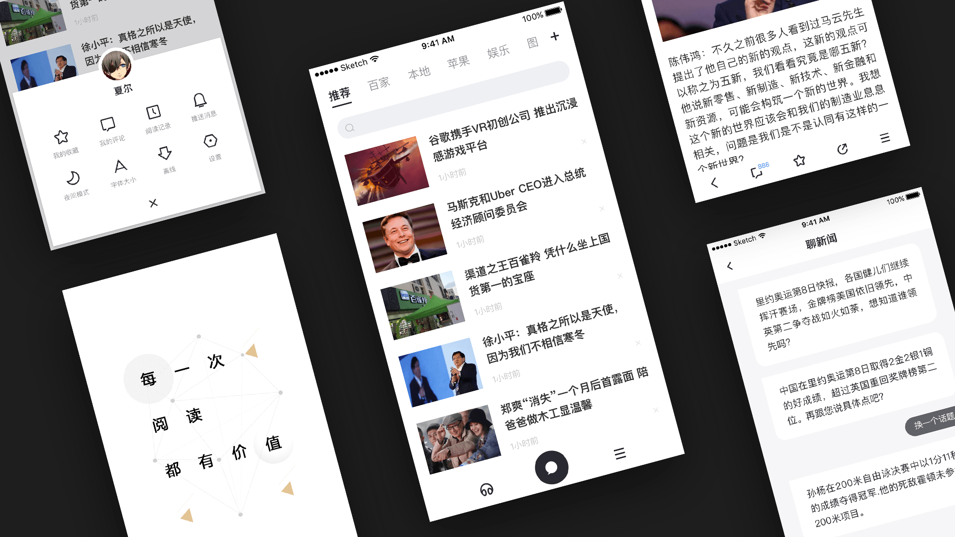
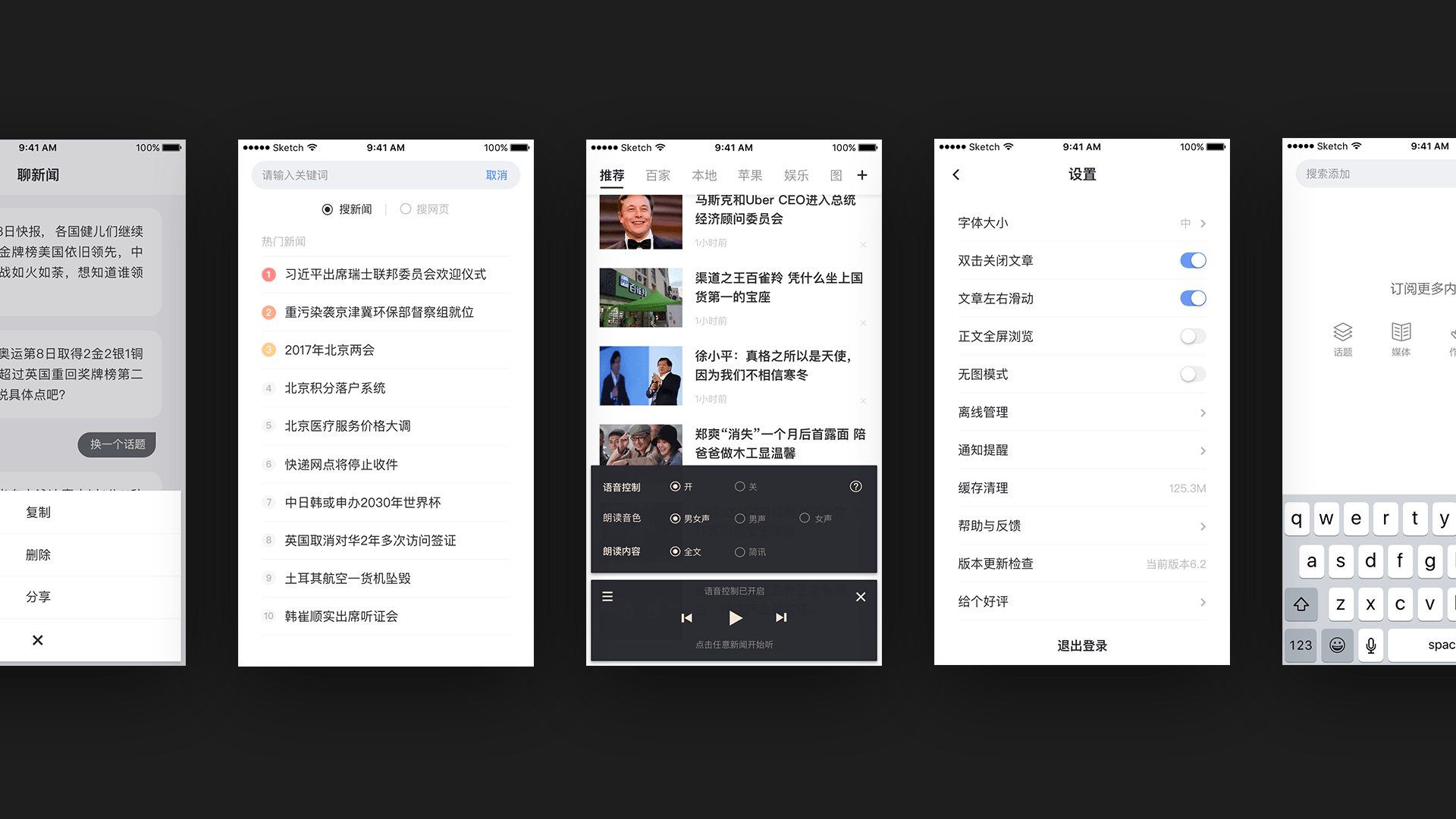
Design Direction
As Design Lead, I managed two designers and led a full redesign of the app experience.
The redesign focused on making Baidu News feel more focused, structured, and trustworthy. We adjusted the overall visual language, typography, layout rhythm, content density, motion details, and key interface states to create a stronger reading-oriented product experience.
The goal was to let users immediately sense that this was a more serious news product, while keeping the interface clear, efficient, and easy to scan. Compared with a broader entertainment or content-feed style, the new direction gave the app a calmer, more editorial, and more credible product character.
Outcome
The redesign helped Baidu News communicate its new positioning more clearly and gave the product a stronger identity in the market.
The work received direct recognition from Baidu President Robin Li and Mobile Business Group General Manager Xiang Hailong, and won the Baidu User Experience Committee Innovation Award. For me, this project was an early example of using visual design, interaction detail, and product judgment to support a strategic product repositioning.

